Select a story sample to look trough first. Extra information can be found below.

Note: these stories aren't optimized for smaller screens.

view as:

2018  •  digital publication design  •  For hundreds of years, designing for the medium of conventional novels was one of formatting; to contain text in columns for the eyes to scan. While there are countless exceptions of work which push things further, how would this idea look like as a medium: a standard methodology of creating a body of fiction?

In its physical form, the modern novel is a long-term container for holding stories. It is a combination of writing, allowing ideas to be made permanent; pages, providing portability; and machine printing, for infinite duplication and mass distribution. Yet, it has remained unchanged in the face of alternative mediums over the past hundred years. Even as novels in digital formats became viable, the conceptual model remains: contain text in columns, which is processed by the reader trough a line-by-line basis, existing on a page. Between the lines is a great divide between the author and the reader; the author’s intended story will never be identical to the one interpreted by the reader. At the very least, the reader’s visuals (e.g. How exactly a character looks like) will differ.

For some writers, the divide is something that should be accepted and embraced. In “Death of the Author,” Balzac argues that by committing a story to the page, the writer is divorced from its existence, merits, and meaning. This is not to say that the author is not liable for their stories, but rather that they have no control over it once it has been committed.

For designers, this divide is an opportunity to communicate trough the novel’s own physicality, by designing a story as if it were closer to a magazine. However, in its creation, the designer creates another divide: that from the medium of the novel itself.

There are many examples of “designed” textual stories, but—as a collective medium—they seem to be shunted away uncategorized; each being its own unique experiment in breaking the rules of how textual stories should be told. This project proposed a methodology to define, and unify them from both the conceptual and pragmatic sense.

For starters, a "designed novel" implies that a designer can design and extend a story to communicate differently. Therefore, a "designed novel" is more an adaptation than a mere extension of the classic text column.

The other differing aspect is that most contemporary example exist in the digital realm, as opposed to conventional novels being most popular in its analog form. The problem lies in that there is no good ecosystem regarding the distribution or creation of designed stories/novels. Some exist as part of a newspaper’s digital offerings behind a cumbersome paywall and are subject to removal. Some exist as a brittle website with their physical presence lost in the ocean of the web, at best as a rarely visited bookmark. Worst yet, some exist as a mobile app, whose ability to even be read slowly ticks down to zero. Mobile operating systems slowly shed away their legacy support and the devices that they were originally built for cease to function.

In order to sustain the long term cultural development of designed digital novels, we must need an easily distributable and archivable format.

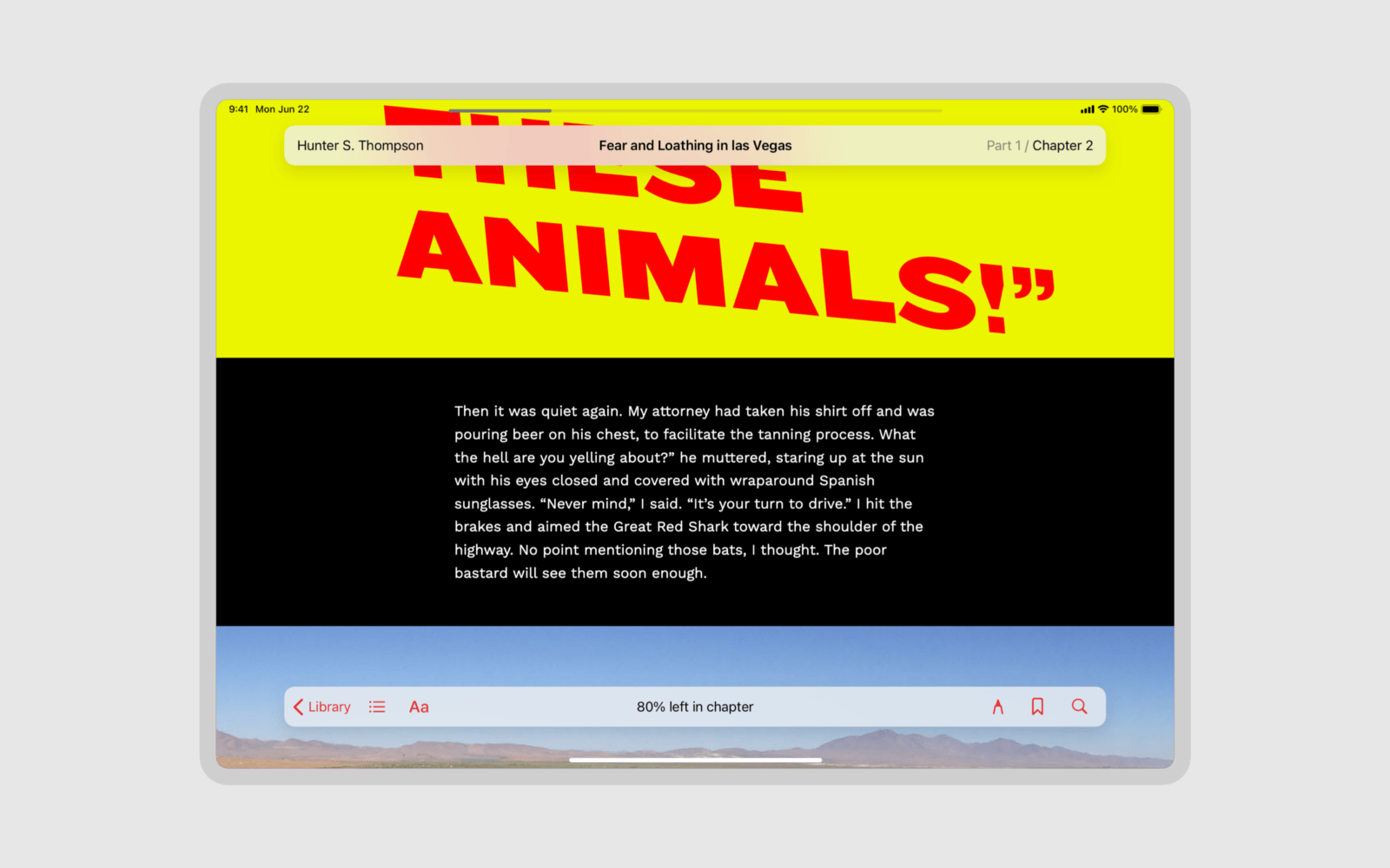
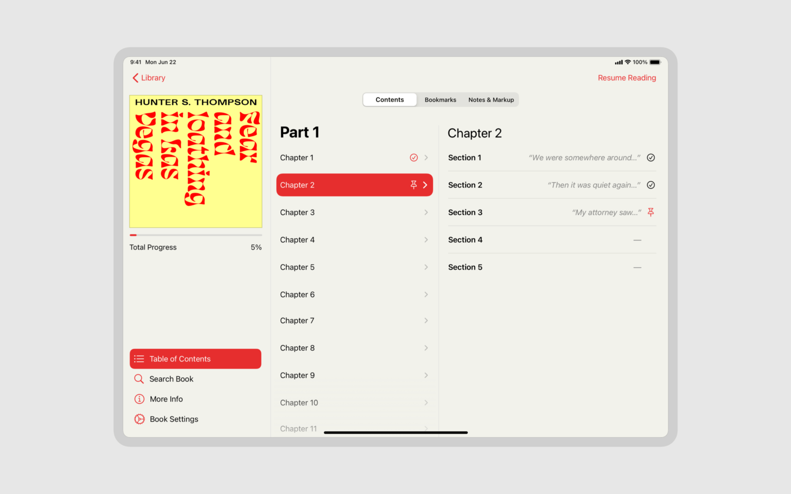
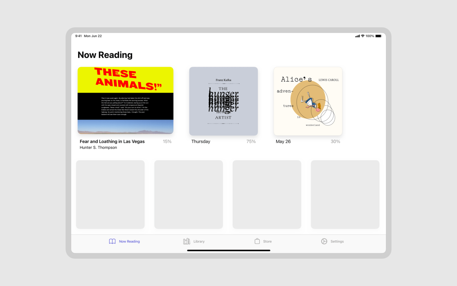
Therefore, I propose a new digital format entitled The web novel. The “web” refers to the fact that it’s rendered by a web browser engine rather than it being an internet-based appliance. Whereas the word “novel” was chosen because it sounds much better than “book.” The format would be a collection of web files (HTML, JS, CSS, etc) and a standardized metadata file compressed into a single archived file (ZIP, Tar, Zstandard, etc.). Critically, in the development of a web novel, one should aim for resiliency and offline-first usage.

Web novels are not meant to be handled from a conventional web browser, but a dedicated app in the line of the Apple Books application. This app would handle at a minimum: library presentation and organization, bookmarks, reading progress indication and saving, and accessibility. For security purposes, each web novel run entirely sandboxed with the assumption of hostile intent, unlike Electron applications.

Due to time constraints, I didn’t have the opportunity to develop the web novels project beyond the samples shown above and a skeleton outline of the potential file format.

designing the hunger artist

Unsettling: to present the authentic essence of normalcy but in a manner in which said normalcy is also inherently disturbing. What is normalcy but a relative unit? The simplest way to introduce insanity to the public is a slow boil of live frogs. The simmering stage is the transition period between the previous normalcy and the next thing; it’s when we still go about our daily lives like nothing’s wrong while the cannibals pop the lid on us and patiently await a rich, meat-falling-off-the-bone, stew served with fava beans and Chianti. The top microscopic slice of the human pyramid—the barbarians—might as well be Hannibal Lecters, and frankly, life might have been simpler if obscure gastronomy was their only concern. But it was these themes of unsettling change and unbelonging that I wished to portray in Franz Kafka’s The Hunger Artist. And getting there was a whole journey onto itself.

I’m guilty—extremely guilty—of not having read any of Franz Kafka’s books. Every day, it stares at me from my book shelf, gawking at my body and yelling out slurs in Czech and German about my sexual body parts; The Metamorphosis—it’s a practically hairline-thin novel compared to my previously conquered giants such as Don Quixote, The Wind Up Bird Chronicle, and The Magic Mountain (a great read, in the masochist sort of way, for 2020.) To get into the dystopian bureaucratic mood, I referred to the brilliant game Papers, Please, by Lucas Pope, in which you play as a Passport and Immigration officer in a fictional Soviet Bloc state—simultaneously powerful—and yet—also powerless in the face of The System, like any protagonist in Kafka’s haunted imagination. Of course, Kafka died a long way before Czechoslovakia turned into a Soviet state, but embarrassingly, this was my only familiar thematic reference point.

My second reference point was about typography. It’s simple, a publication about Kafka should use Czech typefaces. No ifs, no buts. Period. Thankfully, Storm Type Foundry delivered. This Web Novel use two of their typefaces: Academica and Preissig Antikva. True to its name, Academica was designed for academic texts, lending its serious and somewhat bureaucratic persona to the story. Although I particularly enjoy that it makes the text vaguely look like a used paperback novel; you know, when the pages yellow out and the misprints cause the ink to bleed, causing an unintended heavier type weight and colour. Best of yet, it does look like a strange and uncanny Times New Roman, the defacto "default" serif typeface. Preissig Antikva is used for display type; the opposite of its intended purpose relative to its predecessor. It’s an unusual typeface that looks like it shouldn’t work, yet does; at least on print. Its strange angular strokes evoke the bones and skulls of catacombs and the slender, skeleton-like silhouettes that make up the bodies gradually dying trough starvation. It is simultaneously ancient-looking, and novel enough to be a contemporary design in the 2020s. Perfection.

Well equipped, I struggled to produce anything good. There was context and misery—the basis of existence and living, and there was form—trough the use of text and typography. But I was missing the soul, or rather, the manner in which the soul moves trough life.

The missing piece turned up in the most unlikeliest of places; the film 81/2, by the legendary Italian director Federico Fellini. Its plot follows a film director in a creative block during the pre-production of his film. His life's existence is in purgatory. The producers push to get the film made: casting actors and building sets; but the director has no script or story.

Eventually, the producers—rightfully fed up with his shit—force him up to a press conference right outside an elaborate set where they would announce the start of filming. There’s no where left to run. The two producers link their arms with him like a prisoner of war heading towards the shooting gallery. The overwhelming press question his health, story, and his position on political issues. His estranged wife laughs at his inability to answer anything. The producers elude to bad things afoot, whispering something akin to, “listen, you piece of shit, I spend millions and many months on you, so you better deliver, or else.” Hell, it turns out, really is other people. His seemingly psychic friend slipped something in his pocket. He crawls under the table trying to cover his ears, the hands of his producers and the press trying to reach in like zombies on their prey. He takes out the gun and pulls the trigger.

This scene captured the soul I was missing: the alienated misunderstood soul. More specifically, it mirrored a similar scene in the story where the Hunger Artist is forced out his cage against his wishes. He wants to starve for longer periods in order to beat world records; but the band plays, the crowd surrounds, and the people force him out the case, and then, most worst of all, force him to eat.

I dementedly played that five minute scene from the film on repeat for what lasted many hours, watching and listening to Guido Anselmi's agony, misery, and suicide, over and over and over, until I finished my first design draft. As for the design, the body text should be self-explanatory, but the display text was to represent the Hunger Artist’s inner voice: “I have no mouth but I must scream.” Into the void he goes, unheard and unacknowledged by anyone.

So it goes.

Note: this work isn't optimized for smaller screens.

view the work

designing Fear and Loathing in las vegas

"He who makes a beast of himself gets rid of the pain of being a man."

—Samuel Johnson

Lacking substances or an interesting life, I was left to look inward in order to design for Gonzo. Find the raw animal within, the tormented and suppressed degenerate, and satisfy its needs. At this point, I was a little fed up with the clinical cleanliness of contemporary design: as if we were turning ourselves into emotionless homogeneous robots in white walled concrete skyscrapers. I needed something violent; to unleash the inner angst, even at the risk of visual diarrhoea. I flipped my middle finger to those "design rules" and its associates such as Dieter Rams and Robert Bringhurst. Their portraits was to be the toilet paper to wipe the remnant liquid stool off my surrounding asshole. I did, however, leave myself one rule: if they’re high in drugs so should the page; if they scream, so should the text. This is what I haphazardly threw together.

Note: this work isn't optimized for smaller screens.

view the work

Designing Alice's adventures in wonderland

Alice's Adventures in Wonderland has been treated and adapted just about a million times. It might not have been the most original source material, but it was a good baseline for verifying the Web Novel concept.

The original direction relied on basic shapes, primary colours, and typography. This was switched to an illustration based approach as a means to explore different avenues for web novels. My direction differs from conventional picture books in that body text, display text, and illustrations are designed holistically and integrated with each other. In a few instances, illustrations even replace portions of body text altogether.

As a medium, this approach is the inverse of the comic, despite its similarities in holistically treating page content. The comic, with exceptions, is framed around the picture. Even text-heavy comics are usually set within the picture plane set on a grid. In comparison, this concept has an inverted relationship with pictures set around text, or, at the very least, under a text-based grid as opposed to an image panel based grid.

Note: this work isn't optimized for smaller screens.

view the work

Web novels are envisioned as offline-first collectible files, as opposed to websites hosted on the internet. They are to be read in dedicated apps which would also handle additional features such as: accessibility, bookmarks, notes, and markup.

This index page acts as the central hub of the book. Book progression and indexing is handled natively by the app. As chapters can often take up an entire "page," they have been split into sections to make progression less of a daunting task. The colours of this page can also be customized by the author, as shown here.

A dedicated app would also let people nicely organize their web novels as opposed to have them scattered across a file system. However, at the end of the day, they're a compressed folder of files no different than EPUB or PDF in matters of distribution and archiving.

related work