I believe we can learn more about life from novels then just about any non-fiction book as they inspire us with the perspectives, viewpoints, and stories from the overtly mundane—to the point of strangeness—to the most magically wonderful—to the point of normality. These are the people who’ll never exist exactly as they were told along with the bizarre lives they lived. And us, the reader, are only there along for the ride looking trough everything outside them, of what they don’t know, or the world trough their own eyes with the same unknown unknowns they themselves face. If truth is truly stranger than fiction, maybe the best way to prepare for our own lives is to read of those who have never actually existed.
Sunk down to the deep well of a good novel, I always imagined myself as someone else, as if I stared at my bathroom mirror and saw a different being than the one I was supposed to be—the right side of my brain translating these carefully designed letterforms into words, sentences, and finally into the non-existent images remembered for a lifetime. Italo Calvino’s If on a winter’s night, a traveler, is the great exception to this rule. I dwell deep down between the beautiful words and see my own reflection staring back at me at the book store window. What else could one possibly imagine with a novel set in the unorthodox second-person perspective?
More precisely, I visit this book store because this novel I’m holding, also entitled If on a winter’s night, a traveler, is a misprint. During the printing process, the spreads have been mangled with the ones of a different book, and only segments of the first chapter remain intact. I find another woman who has the same issue, and together we set out to find the rest of the book, leading to a series of twists and turns as I end up reading cliffhangered first chapters of many other fictional novels in all the intermediate chapters. This starts the main plot of the novel, and it's bloody brilliant.
I think the most great novels as the ones that offer more questions than answers; the question this book gave me was what possible stories could be made from the readers themselves that exist outside the novels? I set this question out at its extreme; a story about stories with its narration removed altogether. The confusion, chaos, and interpretation of the missing pages would become the real story of the novel as created by the reader themselves, each unique and different. Granted, this probably wouldn't lead to an exciting story, but I feel it to be interesting enough to pursue for its own sake in the same manner as John Cage’s 4′33″. [ 1 ]
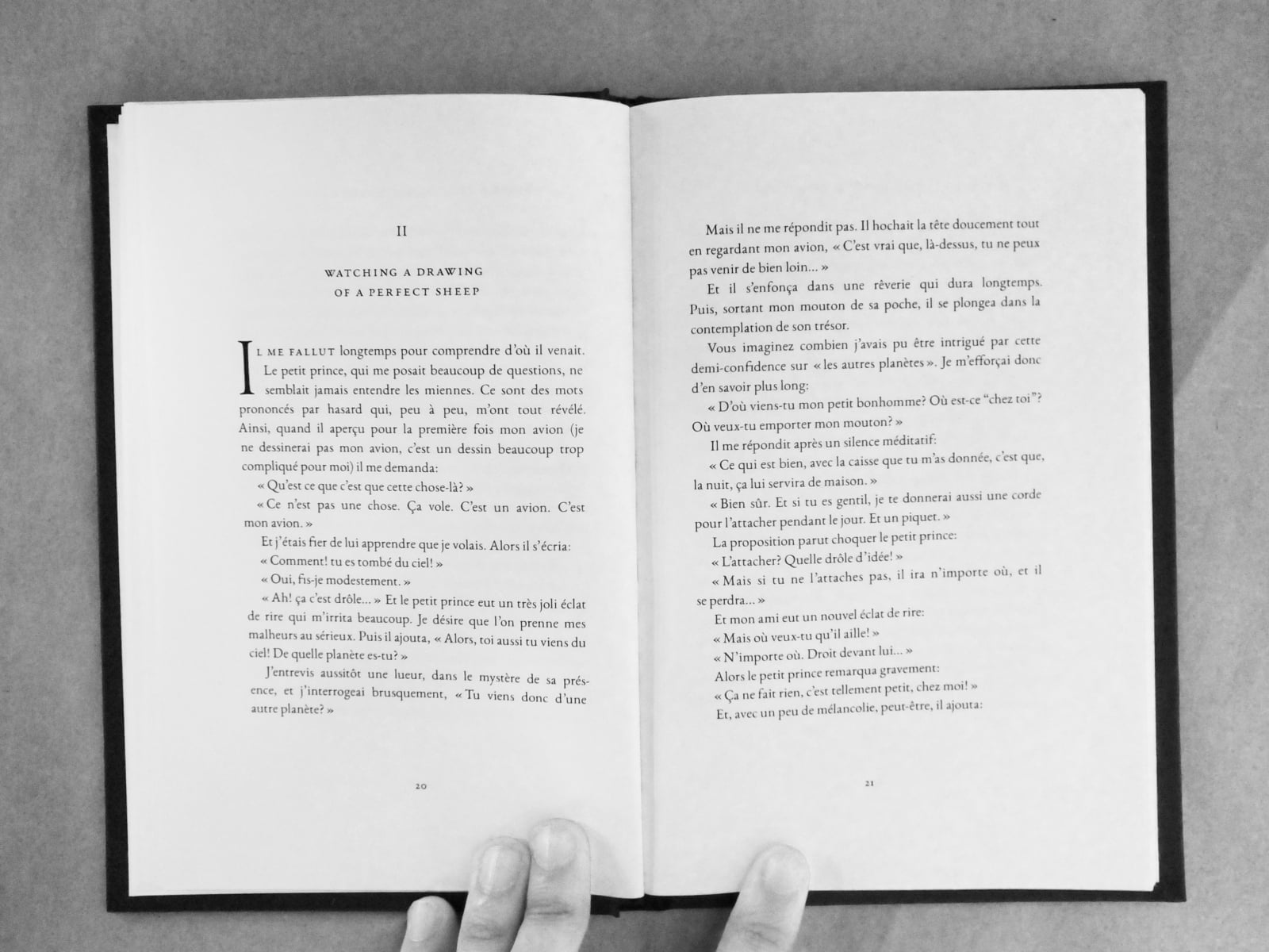
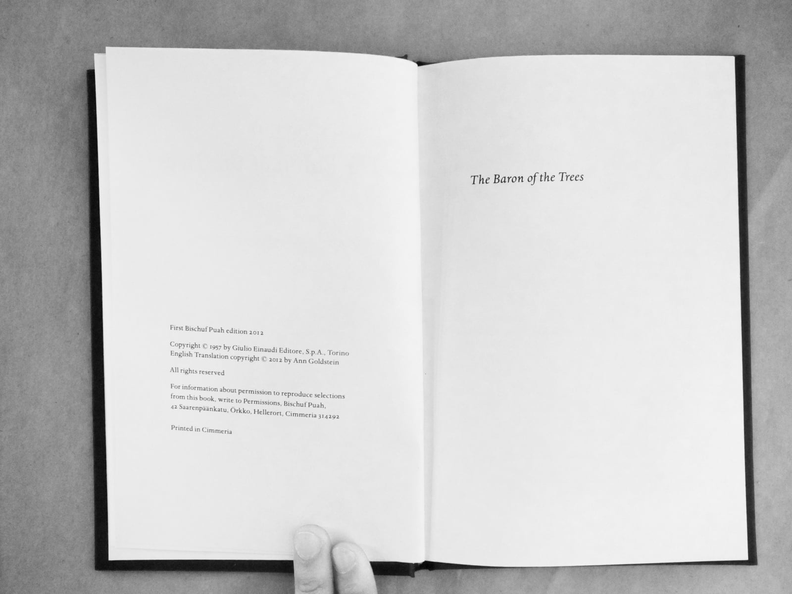
But it was’t enough to merely have a novel with meaningless string of chapters; I needed a Rorschach test. Playing on the author’s work of literature, I decided to embed the segmented chapters in between the first and last chapters of Calvino’s The Baron in the Trees, which I’ve disguised as a seemingly pirated edition entitled "The Baron of the trees." I copied the typesetting as precisely as possible to the Mariner edition but set the publication company and city to those of a Cimmerian one. [ 2 ]
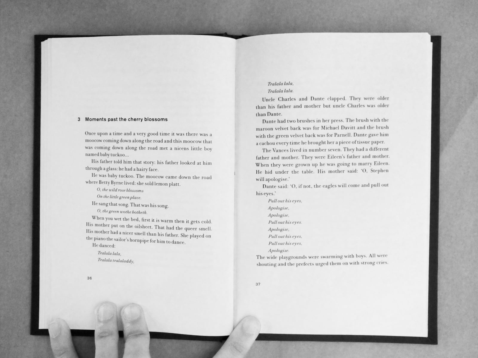
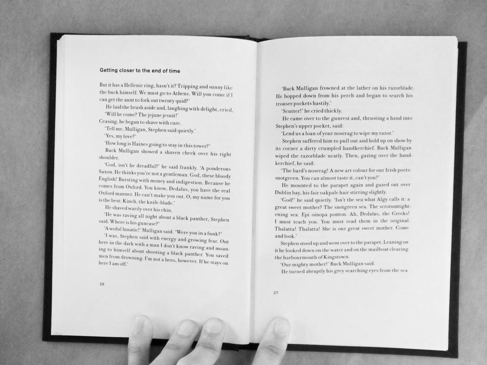
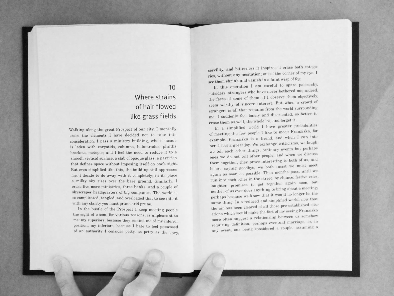
As for the intermediate chapters, I decided to split the stories up into four categories: Classical, Modernist, Post-Modern, and Contemporary laid out in the same mathematical structure used in Calvino’s Invisible Cities. [ 3 ] The stories ranged from from Thomas Mann to Haruki Murakami, to—quite sneakily—from If on a winter's night itself.
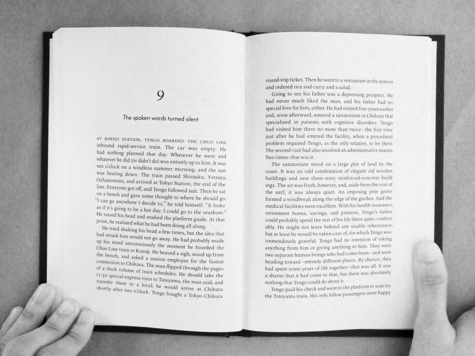
All the stories come with accompanying typesetting from their respective era, stylistically transitioning from one to the other. The Classical era is set in Garamond [ 4 ] with a strict Humanist text layout and drop-caps. The Modernist era keeps the strict grid, but removes ornaments in favour of Akzidenz Grotesk and Bodoni; these typefaces helping it feel strictly Modernist as opposed to vaguely contemporary. The Post-Modern era eschews the strict grid and uses right to left text-alignment for its own sake, with a eccentric typeface pair of FF Meta and New Century Schoolbook. [ 5 ] The final contemporary era returns to centered titles typeset in Futura and Lyon Text respectively.
There is fact, a "novel" or—rather, a story—of my own embedded within. Maybe a person reading this 1/1 edition might find out one day, but I'd rather have them create a more exciting one of their own first.
In reflection, I do wish I had improved the atrocious and shameful word spacing and typographic colour.
footnotes
- [ 1 ] Read about 4′33″, or view a performance.↲
- [ 2 ] Cimmeria is a fictional country in If on a winter’s night a traveller. I created a fictional publication company called Bischuf puah, which translates to Bishop Books (or Book Bischop) in Cimbrian, the real life counterpart of one of the fictional languages in the novel. In addition, I put the building in a street where it would reasonably exist, had Cimmerian been a real country.↲
- [ 3 ] Read about Invisible Cities. The Wikipedia warnings are there for a reason, however, this is the best neutral book overview and it describes how the chapters are laid out.↲
- [ 4 ] Specifically, EB Garamond. I really liked how it was designed from the how Garamond prints on the page at size-specific founts as opposed to the clean Adobe Garamond with an all-rounder default weight. Adobe Garamond was used for the drop caps as EB Garamond lacks a display weight.↲
- [ 5 ] Some numerals came from Fira Sans out of personal preference.↲