Allow me to start with a restaurant. I clenched my designer teeth as I walked inside the sketchy looking family-run joint—passing by the Comic Sans sign—and grabbed a seat in this sleeper of a murky space. But—the food—bloody hell—the goddamn food; stewed oxtails with hearty rice and beans and a simple salad to balance it out, it's what I needed on my shitty day. I felt a sense of lightness and warmth in my body to counteract my dying cold and heavy soul that eternally screamed into the void lacking a physical mouth. For now, everything was suddenly alright with the world, even my wallet—until tomorrow. This was a beautiful place; a beautifully un-designed place.
As a designer-artist, I have a hate-love relationship with my own profession. For over ten years have I lived in Vancouver, Canada, one of the most expensive cities in the world. [ 1 ] And if there’s one constant truth I’ve learned living there, it would be that good design favours the wealthy and the ones that don’t deserve it. That aforementioned restaurant might never get a designer to work their professional visual identity. As for that expensive Vegan salad bar displacing a family-run joint, that's a 1/3 of their budget. [ 2 ] It's quite appaling that one of the most effective techniques for getting good food for your money is to purposefully avoid "well-designed" places. In particular, one should avoid places that use a pleasantly spaced Grotesque or Geometric typeface in their logotype, and especially if they have an ampersand (“&”) or an "and" in their name.
As designer-artists keep designing for the wealthy and their needs does the general style of design of anything become that. It means being able to upsell products relative (significantly higher) to their actual value. Specifically, it means appealing to the young crowd with disposable income; even better yet, it means being able to dictate and control their culture and that they should require all these useless stylistic things. [ 3 ] From an aesthetic standpoint, this is achieved by blending in to what fits the "trend," a simple pendulum that swings back in forth as a means to contrast to the previous norm. It's a screaming competition for attention: bold colors against subtle colors, black and white versus any color at all, low cut and high cut, Grotesks and Humanists, and so forth till us humans completely obliterate the Earth trough the manufacture and consumption of useless things; the lucky few ultra-rich spending their final days suntanning on their red soil.
In this era, we are simultaneously drunk on individualism and needing a unified and communal sense of belonging. As the lather is significantly easier to design and manufacture for, we realistically end up with a manufactured community deluded by themselves being individualistic.
On to the contemporary music festival, the pinnacle of the false manufactured community. While its short comings from a design perspective were obvious, embarrassingly—with my then-non-existent social life—I’ve never actually attended one. So in designing this music festival concept, I asked Liam—my design partner—on what makes a good music festival (experience), and he gave me a simple—if somewhat expected—answer, “people.” This became our core premise, a people-first music festival that actually appreciates and acknowledges the land it's on as opposed to gentrify it to tell lies and bullshit. [ 4 ]
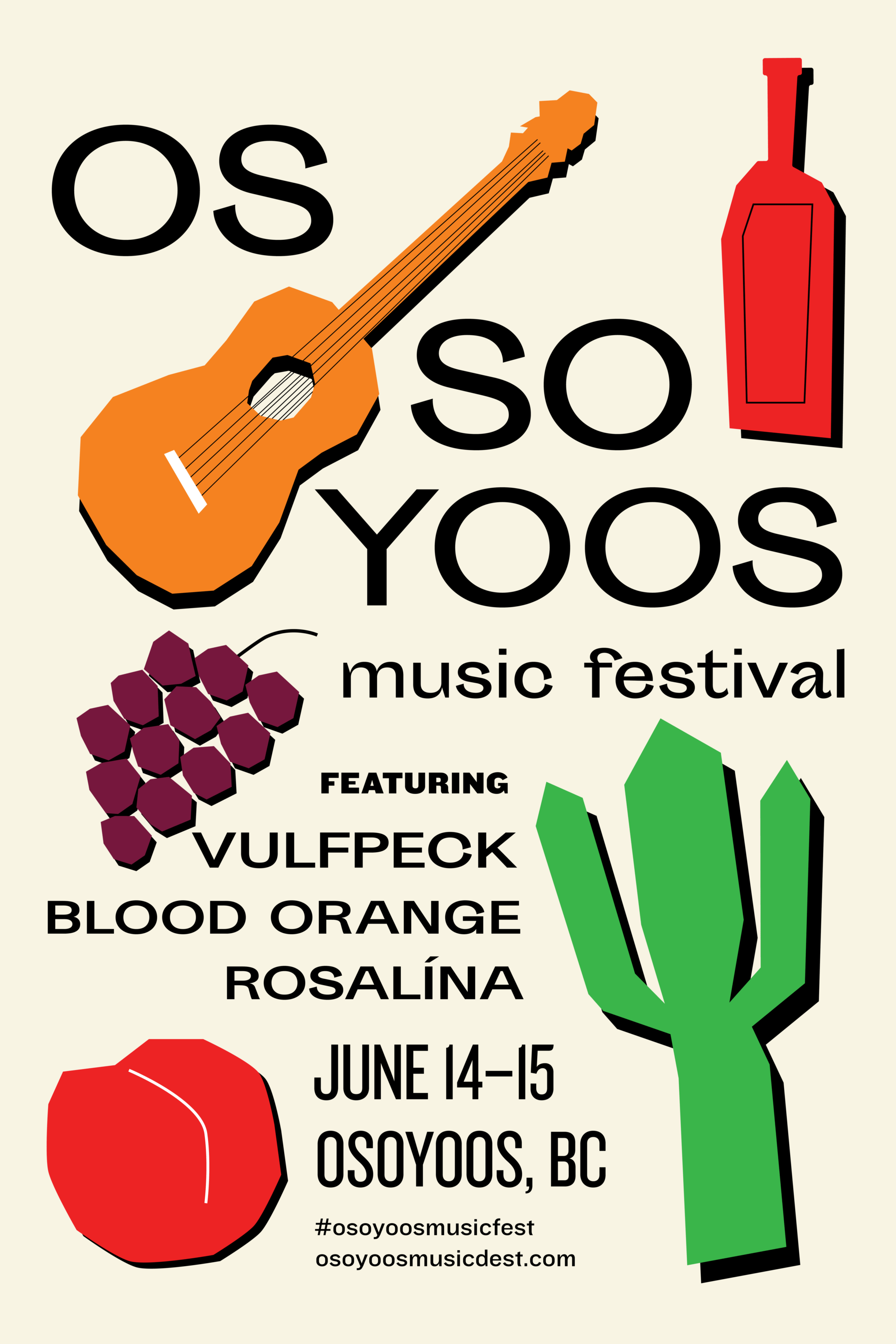
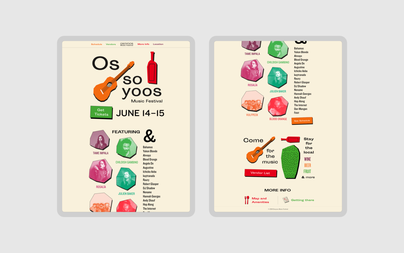
The music festival was placed in Osoyoos, a small town set in the southern desert region of British Colombia known for its fruit production. Combining its purpose with its physicality resulted in the following premise: a grassroots music festival about a bunch of friends coming together set in a desert with fresh fruit.
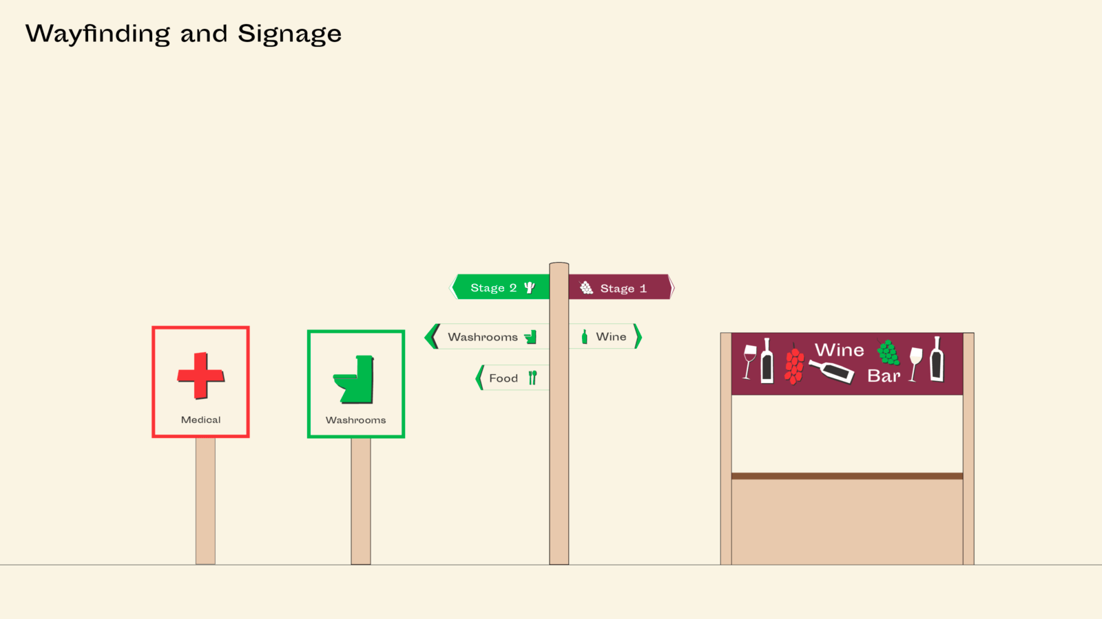
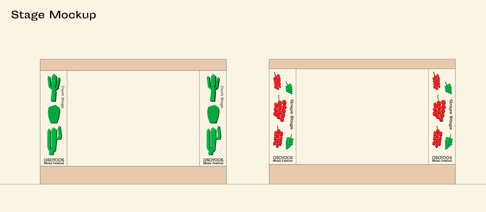
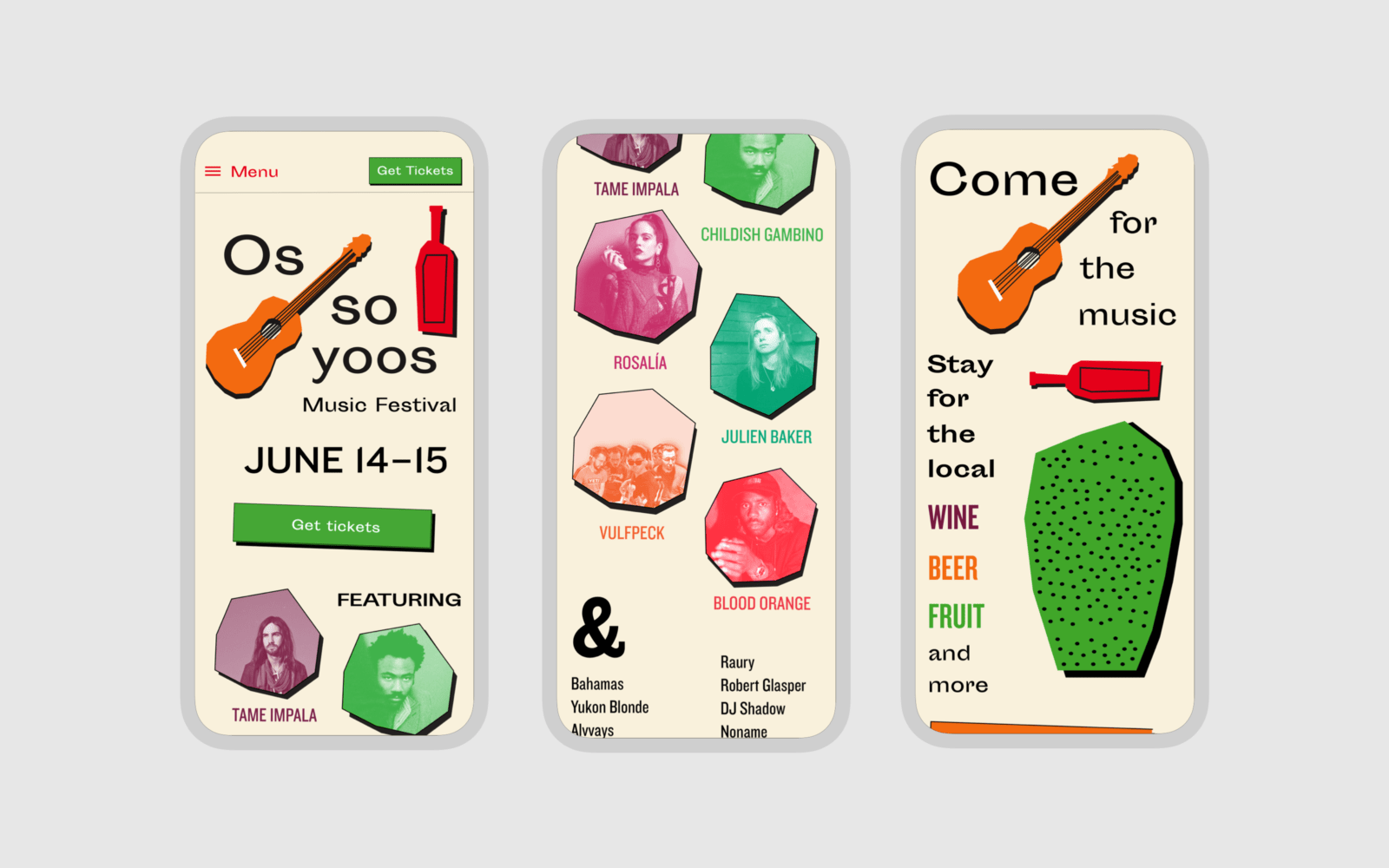
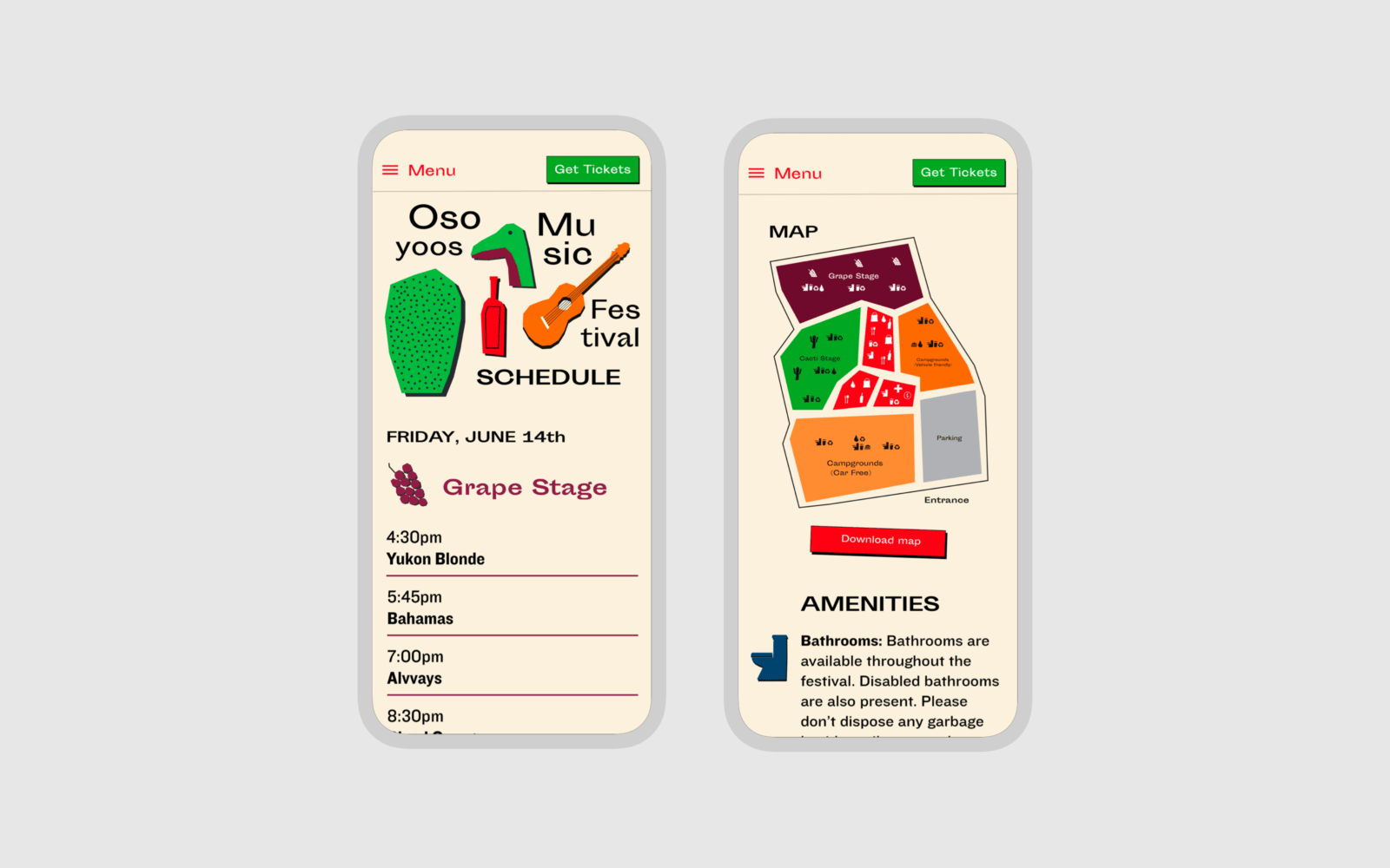
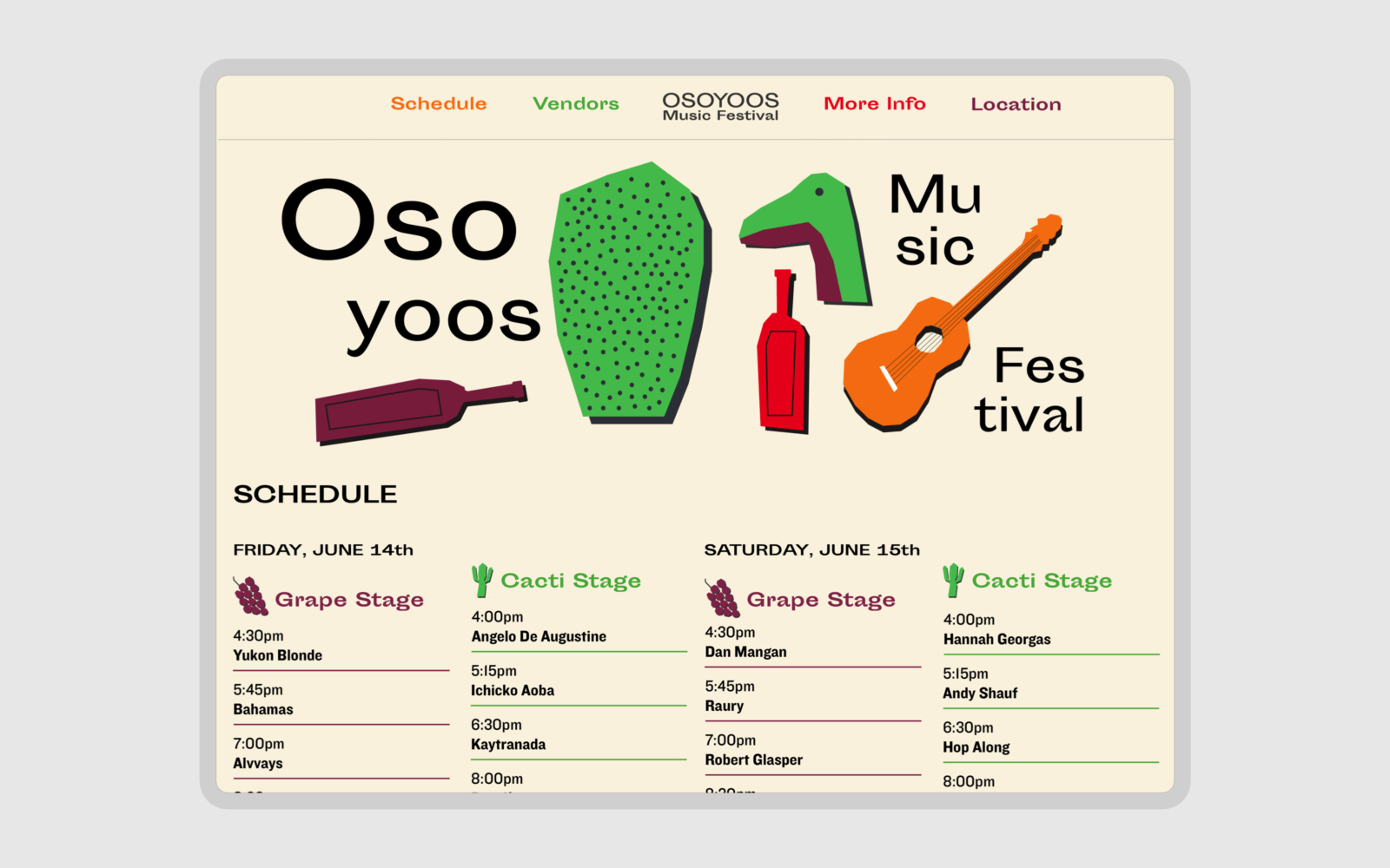
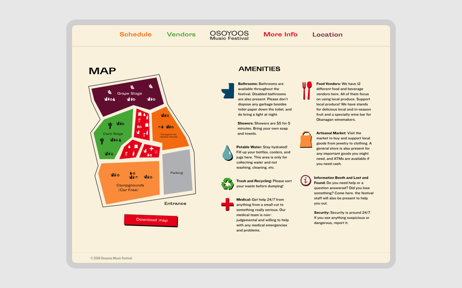
A visual identity was developed based on a series of “hand-cut” illustrations loosely inspired by the Garden Museum. All visual elements are spaced and scaled in an organic manner with Woodcut-esque Typography optically arranged around illustrations. While this is significantly more work, it gives a near infinite amount of unique compositions [ 5 ]. Critically, it allows individual designers working for the festival to speak with their own voice. Liam's fantastic work looks quite different to mine (as shown below), but I believe this to be a strength given that the context is a music festival with theme of different friends coming together. A democratic design that gives space for individualism under a shared style is more powerful than the lens of an individual designer; gawking at their telescope and dictating the world trough a single point of view.
footnotes
- [ 1 ] I was miserable living there, and consider it a terrible metropolitan-sized city for just about everything except: cannabis, snowboarding, skiing, and hiking; none of which are active hobbies of mine.↲
- [ 2 ] While I have nothing against vegans in particular, I do have a grunge against places that sell tasteless vegetables at microscopic portions for meat prices. If anything, they commodify healthy eating and leave the rest of the poorer class to suffer and die on The Colonel, The Clown, or The King's own unique flavour of pink slime topped with rectangular sheets of yellow plastic. That said, I am guilty of eating too much of the lather at my own will. ↲
- [ 3 ] Being in that category, I am equally guilty for partaking in it this system.↲
- [ 4 ] This bullshit entailing that many music festivals set in the wilderness are designed to delude themselves as if they were in a metropolitan city.↲
- [ 5 ] This was in theory of course. In practice, we were two design students with busy schedules and cleverly reused different compositions to meet the class deadlines. But, on the other hand, isn't consistency a design virtue?↲