view as:

2018  •  exhibit / poster design  •  This exhibit explores the most vital aspect of typography to the public: communication. A series of posters duos were designed with identical sentences but entirely different messaging. Visitors were invited to examine each poster and give feedback in the form of “feeling” nouns to express their ideas on what they personally believe the posters to represent. Over 100 responses were collected over the course of the exhibition, including some unique ones written on. This was created as part of the 2018 Type Museum exhibition at Emily Carr University in association with Type Brigade.

“Do not confuse legibility with communication. Just because something’s legible doesn’t mean it communicates. More importantly, that doesn’t mean it communicates the right thing.”

—David Carson

My personal struggle was to present something novel about typography that the general public could learn from and interact with. Many failures of past exhibits relate to badly executed user experience: work that is plain boring, overtly complicated and broken setups, or an essay's worth of text on a wall On the contrary, one of the most memorable and engaging exhibits from the past years was one o the simplest: a giant blank piece of paper on a wall and a sharpie next to a display detailing the typography of graffiti lettering. It's success was based on humanity's most primal of needs: that of wanting to make a mark.

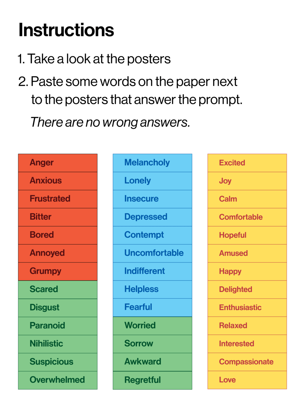
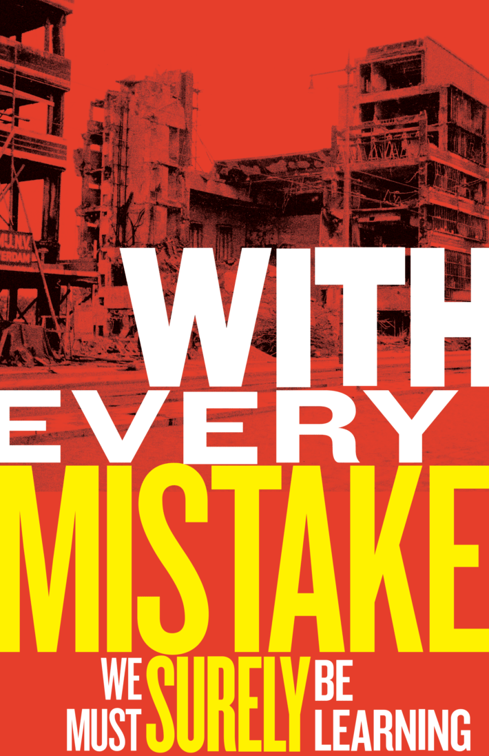
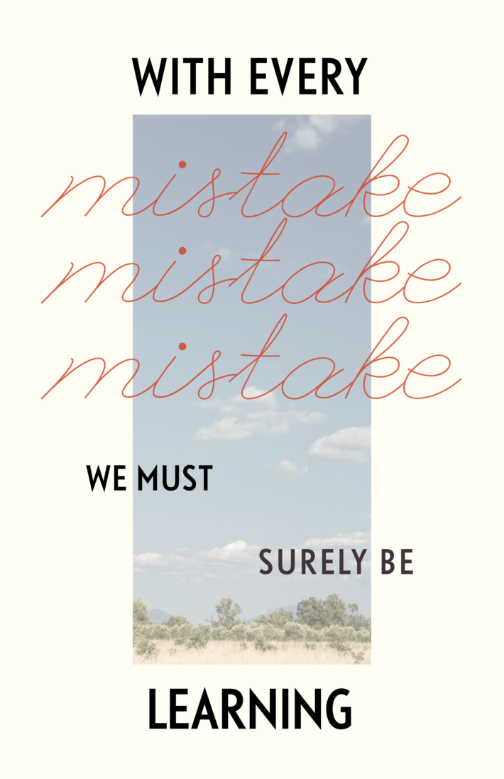
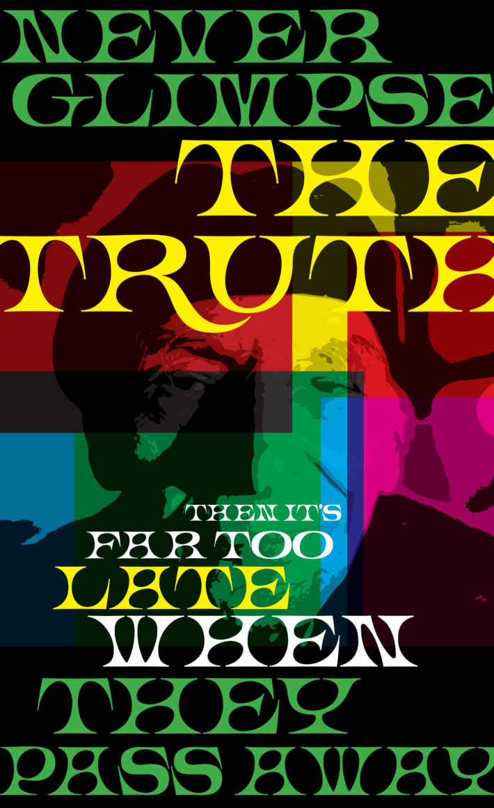
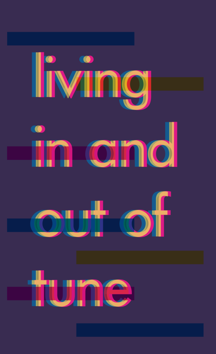
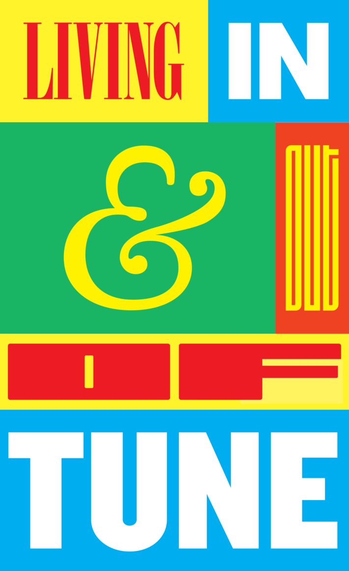
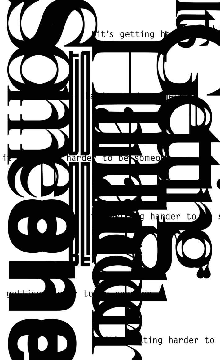
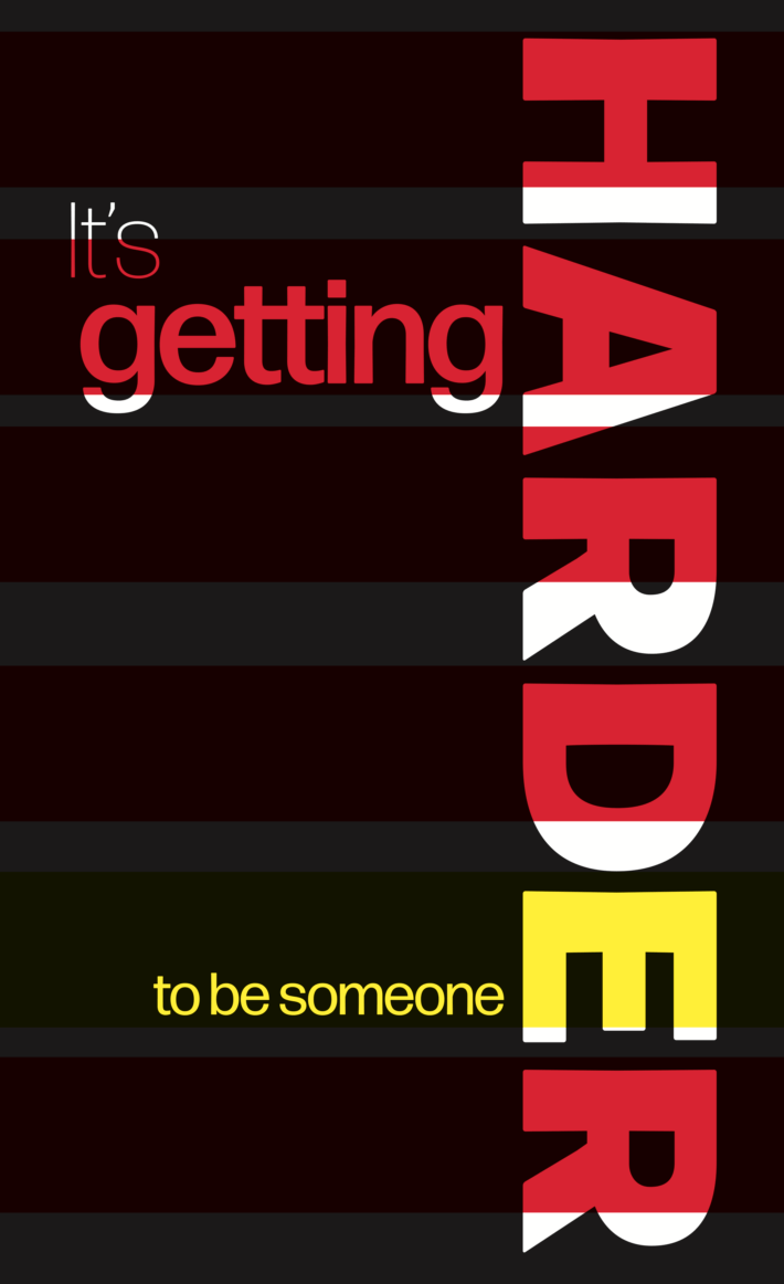
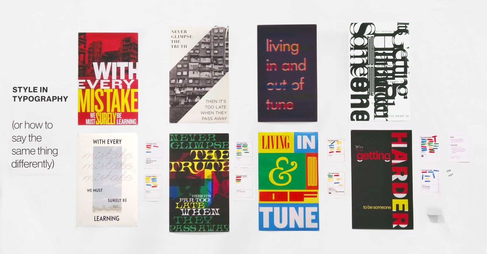
My goal was to capture that same magic, and two-thirds of the way was spent in failure and in vain, [1] until an idea evolved by taking Carson’s quote to its logical extreme: two identical sentences or phrases with completely different—almost opposite—messaging, because of the typography. [2] Poster duos were designed using fragments of vague lyrics. As for its actual meaning, I left it open for interpretation; I’m a firm believer in the Death of The Author and that we shouldn’t dictate the meaning of our work on the premise that we created it. Beside each poster was a page in which visitors could give feedback on what they thought about.

The main goal with the interactive component was to have a unique range of genuine subjective responses in a manner that was accessible for everyone, including the non-designer public that formed most of the crowd. Feeling-based noun stickers were chosen as a form of structured feedback in order to discourage the idea that there was one right “answer” to "solve" for each poster, to give an accessible avenue for non-designers to communicate and analyze design, and to discourage any focus on the peculiarities of the posters from a Graphic Design viewpoint.

footnotes
  • [1] I cried—hard, experiences some non-substance-induced self-hallucinating moments, and curled up into self-defeat deep down the well of forgotten creativity. I thought I was going to creatively rot to the death, or take it upon myself to end self-existence like the director/degenerate Guido did in Fellini’s 81/2. Had I dug myself any lower, I probably would have breached the ceiling of hell and become one with Satan.
  • [3] Well, not entirely. I used word repetition as a design element for some posters and forgot to insert a word in another.

posters + public responses

These instructions were posted to guide visitors on how to respond to each poster. The coloured nouns were stickers that visitors could paste on a sheet next to each poster. There were a lot more nouns than shown above.

"with every mistake we must surely be learning"

with every mistake we must surely be learning  1/2

a poster. Text: with every mistake we must surely be learning
  • anger
  • grumpy
  • bored
  • contempt ( × 2 )
  • depressed
  • enthusiastic ( × 2 )

with every mistake we must surely be learning  2/2

a poster. Text: with every mistake we must surely be learning
  • hopeful ( × 3 )
  • comfortable ( × 2 )
  • delighted ( × 2 )
  • calm
  • relaxed
  • compassionate
  • amused
  • happy
  • melancholy
  • lonely
  • depressed
  • bored

"never glimpse the truth, then it's far too late when they pass away"

never glimpse the truth, then it's far too late when they pass away  1/2

a poster. Text: never glimpse the truth, then its far too late when they pass away.
  • nihilistic ( × 2 )
  • sorrow ( × 2 )
  • regretful ( × 2 )
  • suspicious
  • depressed ( × 2 )
  • melancholy ( × 2 )
  • contempt
  • indifferent
  • calm
  • comfortable
  • relaxed
  • bored
  • annoyed

never glimpse the truth, then it's far too late when they pass away  2/2

a poster. Text: never glimpse the truth, then its far too late when they pass away.
  • overwhelmed
  • suspicious
  • disgust
  • paranoid
  • anxious
  • bitter
  • anger
  • annoyed
  • "Extasy!"
  • "Dadaism"
  • interested

"living in and out of tune"

living in and out of tune  1/2

a poster. Text: living in and out of tune
2
  • calm ( × 3 )
  • amused ( × 2 )
  • interested
  • happy
  • uncomfortable
  • lonely
  • indifferent
  • helpless
  • overwhelmed
  • worried
  • bitter
  • bored

living in and out of tune  2/2

a poster. Text: living in and out of tune
  • excited ( × 2 )
  • delighted
  • joy
  • happy
  • bored
  • annoyed
  • "angery"
  • awkward ( × 2 )
  • uncomfortable

"It's getting harder to be someone"

It's getting harder to be someone  1/2

a poster. Text: Its getting harder to be someone
  • scared ( × 3 )
  • worried ( × 2 )
  • overwhelmed ( × 2 )
  • disgust
  • paranoid
  • awkward
  • frustrated ( × 3 )
  • anxious ( × 2 )
  • annoyed
  • grumpy
  • uncomfortable ( × 3 )
  • helpless ( × 2 )
  • insecure
  • depressed
  • excited
  • interested
  • love

It's getting harder to be someone  2/2

a poster. Text: Its getting harder to be someone
  • fearful ( × 3 )
  • insecure ( × 2 )
  • helpless
  • lonely
  • anger ( × 2 )
  • bitter
  • grumpy
  • nihilistic
  • regretful
  • sorrow
  • excited ( × 2 )
  • interested

real life setup

A really crappy photograph of the setup. It was installed with seconds to spare—in real life it was very crooked.

Data chart

All emojis on this page are designed by OpenMoji–the open-source emoji and icon project. Colors and strokes and SVG code has been altered for integration purposes. License: CC BY-SA 4.0.

related work